SmartOrg’s Innovative Methods Enable Great Portfolio Talks
By David Matheson  4 min read
These invented methods each create a visual analytic aid: the Tornado Chart, the Project Uncertainty Chart, the Innovation Screen, the CFO Chart, and the P&L Roll-Up
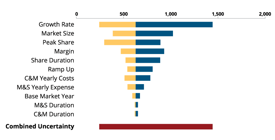
The tornado chart, so named for its appearance, shows the overall range of the project valuation based on the uncertainties of different factors.

The bars show how each factor’s uncertainty compares with the others’. The factors with the longest bars have the greatest sensitivity and therefore impact on the overall project valuation.
Moreover, the bars that extend furthest to the right represent the factors with the greatest potential for moving the project value to the upside. These are the areas where the portfolio and project managers can focus attention and resources to transform the project and exploit its upside potential.

Not all projects have equal potential, but each one gets a share of management attention. Sometimes the upside of a simple project is bigger than many other projects combined, yet it is difficult to shift focus to this opportunity.
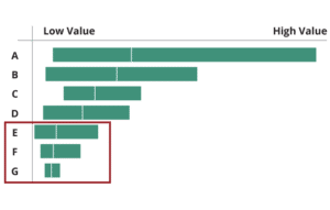
This tool compares the valuation ranges of the various projects in the portfolio. It takes the overall valuation of each project as calculated with the tornado chart and stacks them against each other. This gives a simple visual comparison of their upside potential and downside risk.
Though the bars are ranked in order of expected NPV (the small white line in each bar), that doesn’t mean that they are ranked in order of desirability or priority. A bar that extends further to the right than the one above it may be a better opportunity because of the higher potential for upside growth.
Coupled with the sensitivity analysis from the tornado charts, the project valuation chart helps the portfolio manager construct an upside exploitation plan for the portfolio as a whole.
A good portfolio is not merely a collection of good projects. For example, a portfolio containing lots of risky projects can actually have lower overall risk than a portfolio of projects that individually have low risk. Lots of low-risk projects in a portfolio can create clutter and reduce your chance of meeting overall goals. Pivot by shifting the portfolio mix, not just individual projects

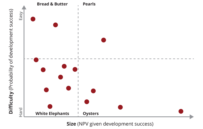
The Innovation Screen maps the relative impact of projects against their relative difficulty. The Innovation Screen divides your innovation portfolio into four types of projects: Bread and Butter, White Elephants, Oysters and Pearls.
White Elephants have high difficulty and low impact. Bread and Butter project are low-difficulty and low-impact and produce reliable, if unexciting, returns. Pearls are those rare home-run projects that make big contributions without a lot of effort. Oysters have the potential to become high-impact Pearls but require a high degree of effort to unlock that potential.
A very interesting insight from the Innovation Screen is that the mix of project types – that is, how many projects fell in each quadrant relative to the total – gives you an estimate the overall power of your innovation portfolio to drive growth. White Elephant projects drag down the aggregate portfolio power, and Oysters and Pearls boost it.
Most innovation budgets are the result of history, not opportunity. By making transparent the link between value and investment, you will be able to spark real-time conversations on the right budget.
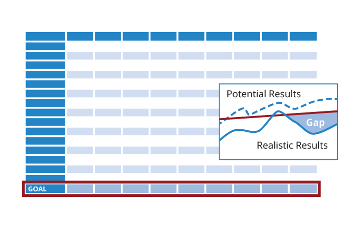
The CFO chart brings the information gained from the other tools together to drive investment decisions. This chart sorts the projects in order of their ratios of return to cost – in other words, their bang for the buck. This ordering represents the most financially efficient priority of projects.
If the order has to be changed to accommodate strategic goals of the company, the CFO chart shows what value will be lost due to the new ordering. The chart also allows management to see what impact on value would result from a change in investment. It also shows what change in investment would be required to achieve a given change in portfolio value.
FP&A stands for “Financial Planning and Analysis,” and it covers several functions that are key to companies’ success. FP&A professionals bridge the gap between those collecting, inputting and analyzing financial data and the C-suite, making forecasts and supporting decisions that affect short-term and long-term performance.

One of the key elements of any planning (the “P” in FP&A) process is the ability to run “what-if” scenarios. Unfortunately, for organizations that rely on spreadsheets this can be a logistical nightmare because it usually involves replicating the same spreadsheets over and over or writing macros for simple data management. Portfolio Navigator makes this a thing of the past, permitting users to run as many evaluations as possible with only a few mouse clicks.