The Executive flinched in his chair. The numbers in his Long-Range Planning (LRP) portfolio were rigorously done, but he had promised a higher performance to the street. Looking squarely at his senior FP&A analyst, he said, “I need to see another $50 million in value from our portfolio. Please make it happen.”
What would you do if you received this request? A huge temptation is to fall back on optimization training and think of allocation algorithms that make some attempt to rationally increment and allocate value. If you are thinking of which algorithm to use, stop. That is a huge red herring. The problem is that a more fundamental conversation needs to take place, one that trades off value with cost. The good news is that we already have a powerful way of holding this conversation.
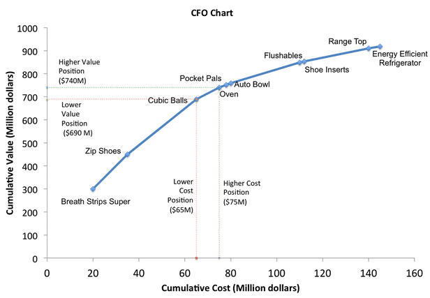
Welcome to the “CFO Chart.” This chart shows products ordered by their productivity (return on investment).

Introducing the CFO Chart
The CFO Chart maps the cumulative value against the cumulative cost of every product, ordered by productivity (“bang for the buck”). Productivity is defined as the ratio of the value of the product divided by the cost of the product. For practical purposes, productivity represents the return-on-investment. The value and cost are probability-weighted averages derived from an analysis of multiple scenarios for each product.
Answering the dreaded question
Using this chart, our FP&A professional can respond to the executive, “Oh, you wanted to increase $50 million in value? No problem. That would require a further investment of $10 million as this CFO Chart shows.” Conversely, if the executive says, “Find me a way to remove $10 million from our budget,” the FP&A executive could say, “No problem. That would correspond to a $50 million value cut for us.”
For the first time, cost and value can be correlated in a conversation that is accessible in a boardroom, and to which executives can be held accountable. Make the CFO Chart your friend. You will find the rest of the organization respecting your ability to handle such a difficult conversation.
If this is so good, why hasn’t this been used already?
In fact, it has. A Harvard Business Review case study, “How SmithKline Beecham makes better resource allocation decisions,” details how a CFO Chart was used to conduct the value-tradeoff conversation with the board. The story goes that when the board saw this chart, instead of cutting R&D, they increased their investment.


