Tornado Diagram: Resolve Conflict and Confusion with Objectivity and Evidence
By Somik Raha  4 min read
When making decisions in organizations, we waste a lot of time chasing things that don’t matter. Sometimes, we even get into shouting matches over what’s most important. To make matters worse, we can often get into analysis paralysis, unable to move the ball forward. And when we do move forward, we are so hung up on risk that we lose sight of the upside and inadvertently destroy the very opportunities we are trying to create. Wouldn’t it be great to have a way of resolving conflict and confusion with objectivity and evidence?
The Tornado Diagram provides just such a way by clearly identifying those factors whose uncertainty drives the largest impact, so you can focus objectively on what is important. This helps us save time, reduce frustration and increase our efficiency.

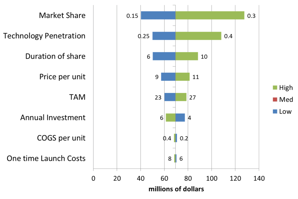
Figure 1: A sample Tornado Diagram showing the impact of each factor’s uncertainty on value
Reading a Tornado Diagram is simple: big bars need more attention; small bars don’t.
This diagram means that uncertainty in Market Share and Technology Penetration have a big impact on value. For these factors, we should be looking carefully at our evidence, doing additional research in these areas, and focusing our creative energies on how to drive the upside. For instance, since Price matters less than Market Share in this example, we could offer discounts to drive up volume. Or maybe agree to a standard with a competitor that will drive overall Technology Penetration.
In contrast, while Total Addressable Market (TAM), Recurring Investment and Cost of Goods Sold (COGS) are important in our value calculation, we don’t need to focus our attention on further analysis or evidence gathering for these three factors because the impact of their uncertainty is small.
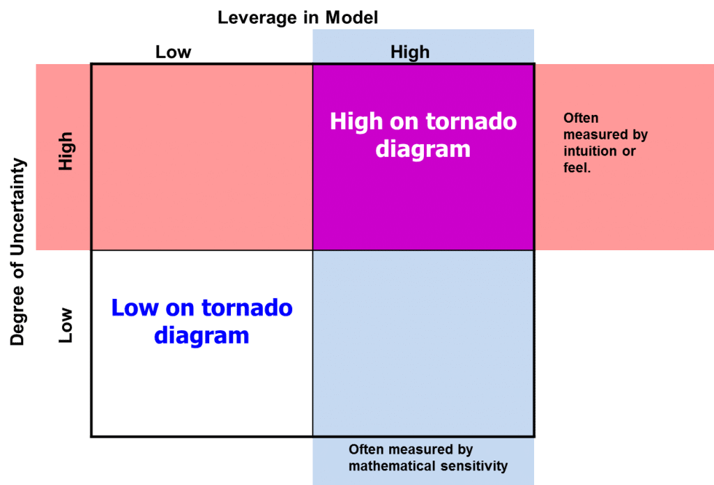
This insight gets us focused on the right factors for further discussion. The Tornado Diagram uniquely identifies those factors that are high in both their impact (or leverage) and uncertainty. (Figure 2) People usually waste a lot of time and energy focusing on the wrong thing because the two most common approaches to managing uncertainty don’t give us the complete picture.
The first approach is that of sensitivity analysis where each factor is varied by +/- 10% (or 25% or whatever) after which, we calculate the impact of this standardized range on the output. While this is a good first step, it is primarily mathematical and not tied to evidence. The Tornado Diagram solves this problem by requiring that each factor’s input range incorporate the best evidence at hand. Moreover, by not being limited to symmetric ranges, we get a better picture of reality, as in the example above, where Market Share is asymmetric and has a much higher upside ($125 million) than a downside ($40 million), which helps us focus on the important question of how to drive the upside.
The second approach focuses on people’s concerns about a large input range. For example, the uncertainty in COGS shows a potential for doubling (from 20 cents/unit to 40 cents/unit) and this could have some people really worried. Other people might argue that a Recurring Investment going from $4 to $6 million could be a disaster. Such conversations can turn emotional quickly. In the context of the Tornado Diagram, concern around “such large ranges” are accepted simply as inputs, and the resulting range on the output helps people put their concern in context. Our conversation can now acknowledge that while we don’t want to drop the ball on COGS and Recurring Investment, we are better off focusing on other factors that are higher up in the Tornado Diagram.

Fig 2. For a factor to be high on the tornado, it must be high in both uncertainty and leverage
If you are interested in a short video (< 5 mins) on the mechanics of Tornado Diagrams, click here to watch.
More resources on Tornado Diagrams: